Design
Introduction to User Guides
Asuka Li
Sep 14 2023 · 2 min read
Getting users to sign up for your product is not an easy task. Product teams must invest a significant amount of time, effort, and money to increase the number of registrations. However, an even more challenging issue is that many users, after completing the registration process, only try the product once and never use it again. Therefore, a high-quality onboarding process (user guide) can help your product make a good first impression and retain more users. When designing a new user onboarding process, there are several considerations to ensure that users can quickly familiarize themselves with your product and understand its actual value.
Avoid lengthy tutorials
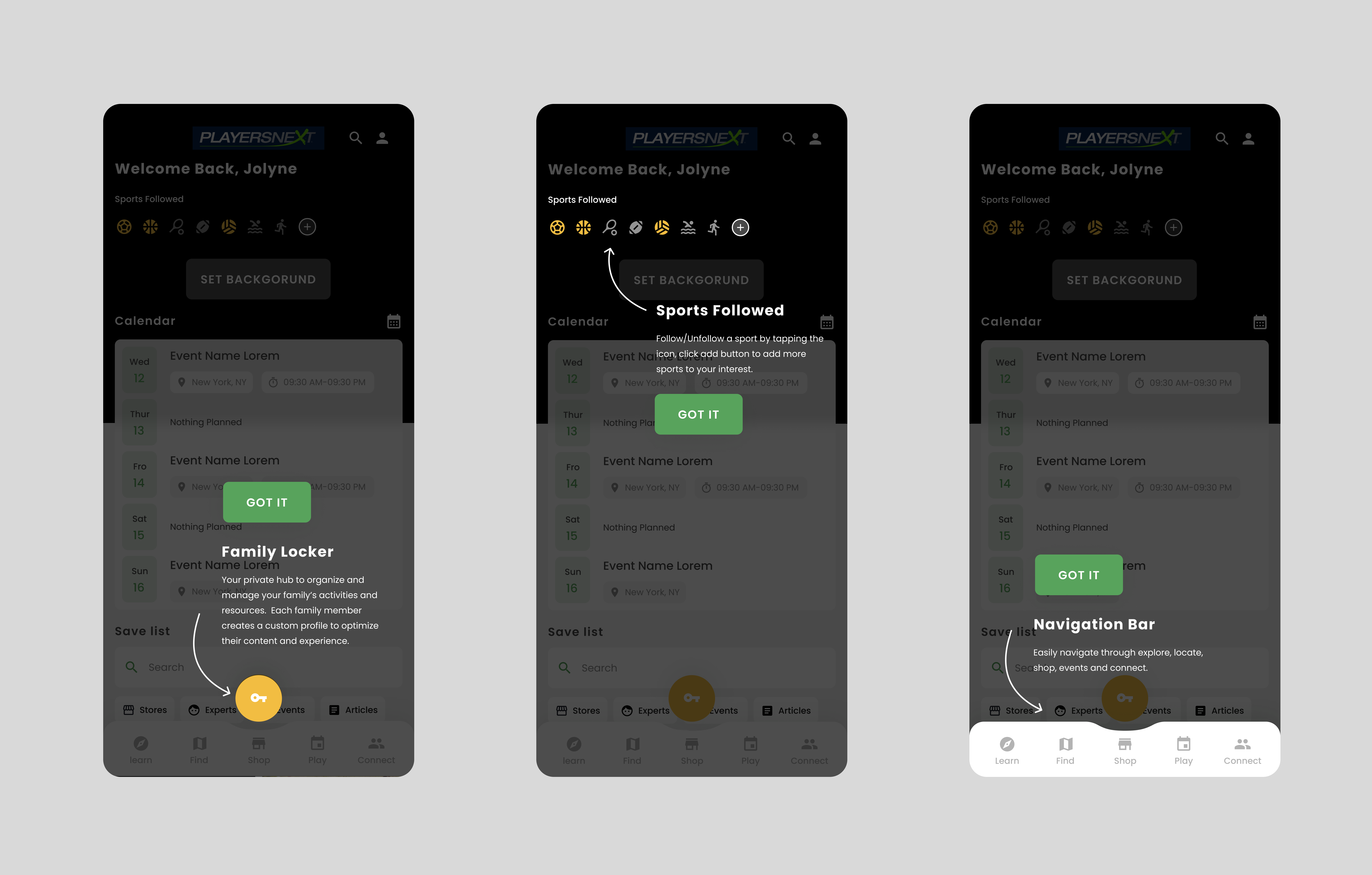
Example: Playersnext only introduces the core features upfront.
To minimize potential friction in the user flow, it's best to follow the principle of "less is more." Avoid lengthy tutorials and instead aim for concise and engaging introductions that highlight the product's key features and benefits. Breaking down the tutorial into short, interactive sections allows users to learn at their own pace. Additionally, consider providing the option to skip the tutorial for users who prefer to explore the app independently. This approach strikes a balance between providing necessary guidance and accommodating user preferences, resulting in a more effective onboarding experience.
By focusing on clear and concise information presentation, users can quickly understand the core value of your product without feeling overwhelmed. Creating an intuitive and user-friendly onboarding process helps users get up to speed efficiently while maintaining their interest and engagement. Remember, the goal is to provide a seamless transition into your product and ensure users feel confident and knowledgeable about its features.
Contextualize the onboarding experience
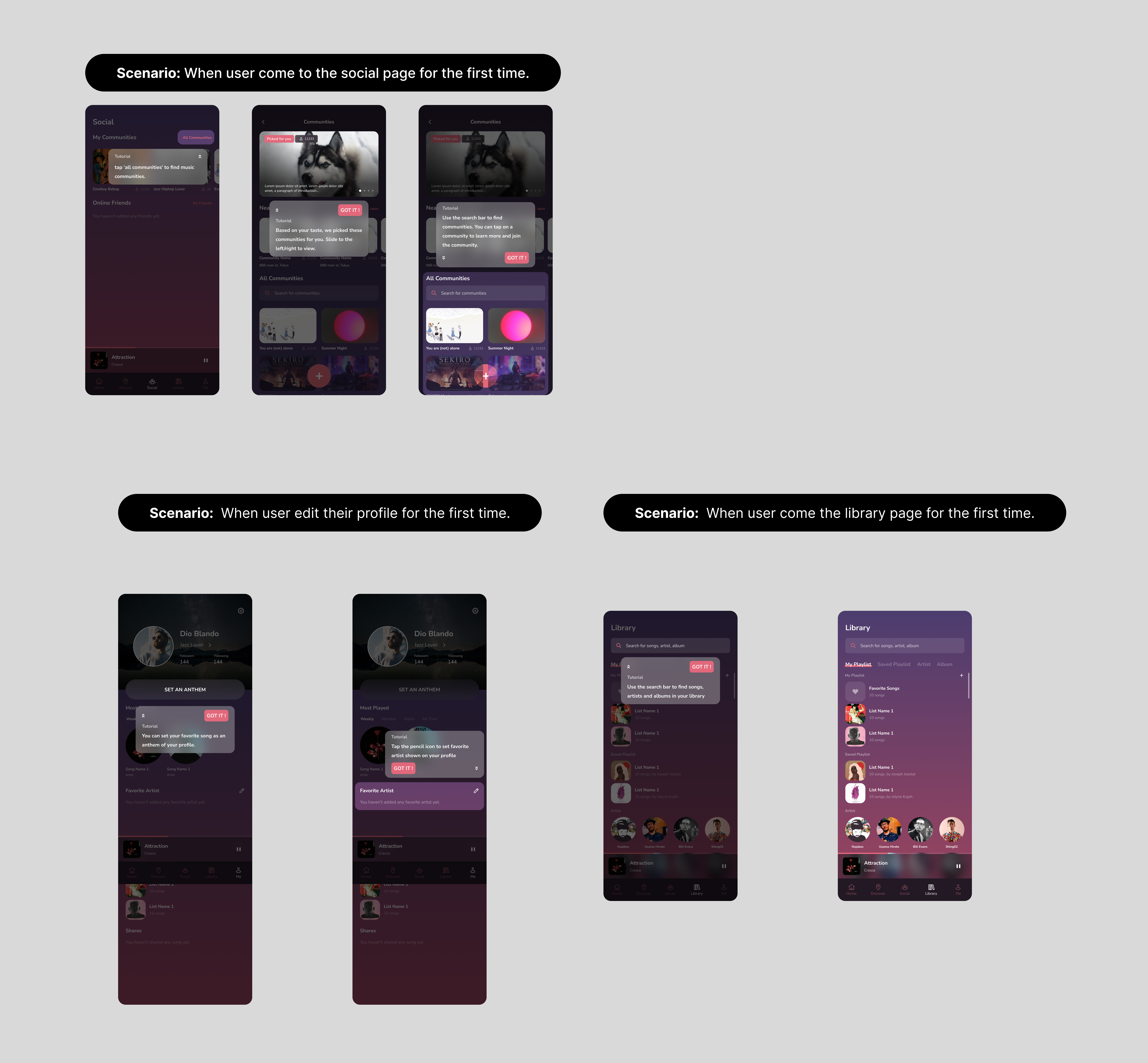
Example: Record Social displays several tutorials gradually and designs them based on various user scenarios.
Instead of expecting users to remember everything, it's more effective to provide contextual guidance when needed. The initial onboarding tutorial poses a usability issue: it requires users to carefully read and remember the provided information before they even start using the app. However, human short-term memory is limited, and the longer the tutorial, the lower the proportion of remembered content. It’s better to gradually introduce the product while the users explore different features. Micro-tutorials targeting specific features are designed for users with shorter memory curves, making the product more user-friendly. In this mode, people can gradually grasp the complete product experience.
Make use of empty states
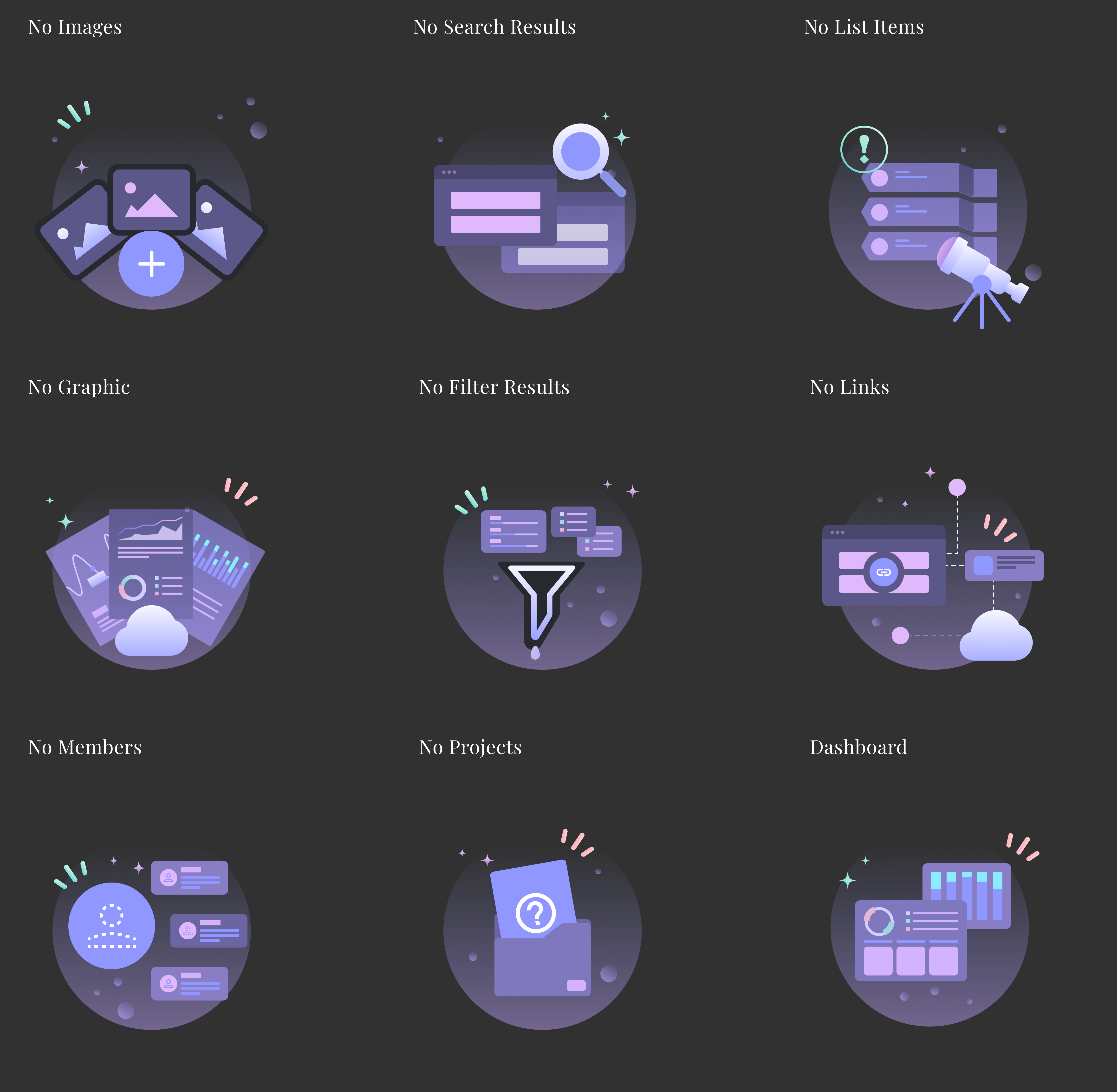
Example: Space Dial uses empty status illustrations to demonstrate the importance of filling them with content.
When users initially use an app or website, many screens appear in an "empty state." It is crucial to incorporate these empty states into the new user onboarding process. First and foremost, the variety of content is the value proposition of an app or website, and it's the reason people choose them. Users should understand the importance of content and satisfy their initial need for content when there is none available. The empty state screens serve as a suitable entry point for the new user onboarding process, so it's best not to leave them completely "empty" but rather utilize them effectively.
Measurement
Once you have designed the new user onboarding flow, it is essential to continuously measure whether users are truly "onboarding" based on their feedback, data, and information. This measurement is crucial, and you should set a specific metric to track changes in the data and make adjustments based on success rates and user responses. Before starting any new project, ask yourself the question: "How will we measure the success of the new user onboarding?"